
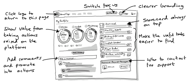
At the start of March, we are releasing some simple but important navigational and ease-of-use changes to the DL platform. The changes will make it easier for you to find the insights that lead directly to comfort, maintenance and energy-saving gains.
See progress

The Actions Progress report, previously hidden deeper in the platform, is now given top billing with a summary on the landing page. This means you can see how quickly value is being realised from the recommendations or "actions" that are created on the platform.
Important tools at hand
We have created a new section of clearer "quick links", with simpler icons, right on the landing page. This is to help you find the familiar data-driven visualisations that are the most efficient at letting you know when aspects of building performance need most attention. A "further links" sections is displayed below these so that you can find views that your Technical Account Manager has tailored for you.
Simpler masthead
We're moving both the customer branding and the account-selector above the line so they are more prominent and more consistently available. This means whoever logs in from your team will know they've come to the right place. The login menu is now behind a drop-down to save space. Note: we have also removed the "Home" link at the top, but clicking the Demand Logic logo will still get you back to the landing page.
Updated actions section
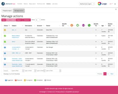
The actions table -- linked from the top navigation and also available from the home page "Manage actions" link -- now has more space to breathe, filling the whole page-width for easier use. You can also get to the Actions Progress Report from the tab at the top.
Improved tables throughout
We took this opportunity to refresh the many utility tables throughout the platform, bringing them a consistent style and up to date with the latest "responsive" styling, so that they are more usable on smaller screens and mobile devices. All tables now allow you to choose which columns you see, configurable from the "Columns" button  at the top of the table. If you are on a smaller screen or mobile device, you may find that some columns become automatically collapsed; you can expand them using the blue + icon
  on the left of the row.


